Học ví dụ nhỏ thêm a Popup Slider to Your Website
9th Nov 2021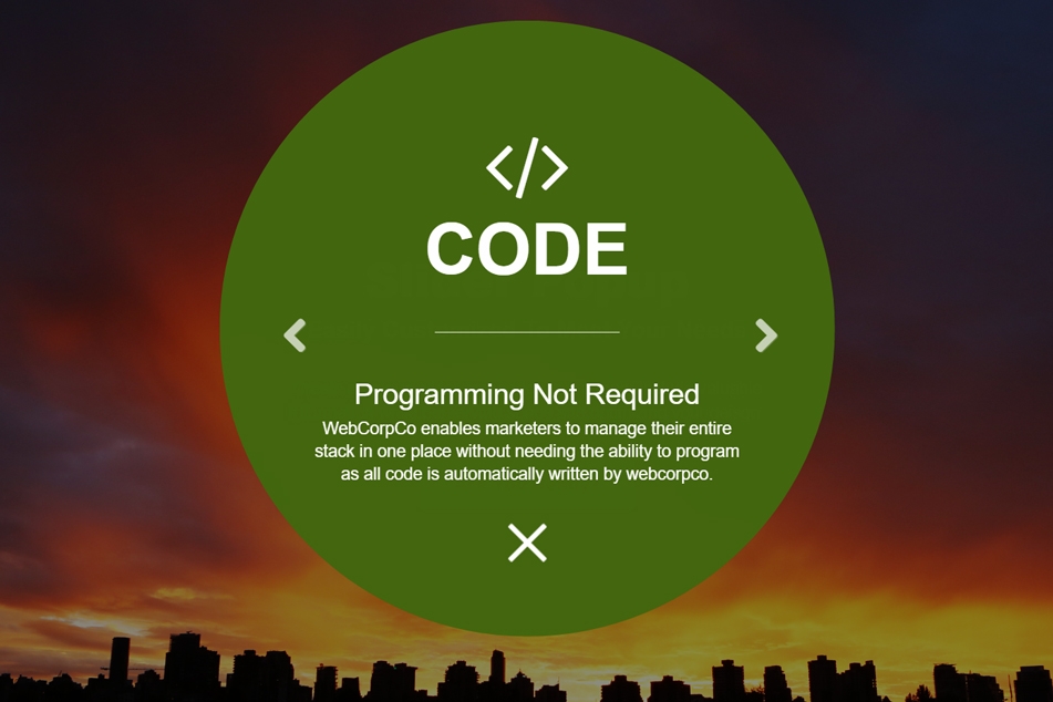


Thanh trượt bật lên kết hợp các yếu tố tốt nhất của mỗi tên. Thông tin được phủ lên trên nội dung cơ thể của bạn, do đó giữ được không gian quan trọng trong thiết kế của bạn.
Chúng tôi đã viết rất nhiều lần về những cách bạn có thể duy trì không gian trong thiết kế của mình đồng thời trưng bày nội dung có giá trị. Trong thế giới thiết kế web, một số thích tạo thanh trượt nội dung trong khi những người khác thích lớp phủ nội dung hoặc cửa sổ bật lên. Điều cũng khả thi là kết hợp cả hai kỹ thuật vào một thanh trượt bật lên.
Thanh trượt bật lên kết hợp các yếu tố tốt nhất của mỗi tên. Thông tin chỉ được hiển thị khi người dùng tương tác và được phủ lên trên nội dung cơ thể của bạn, do đó giữ được không gian quan trọng trong thiết kế của bạn. Hơn nữa, thanh trượt cho phép bạn bao gồm nhiều phần mà nếu không sẽ phải cắt bớt trong cài đặt cửa sổ bật lên truyền thống.
Sử dụng FlexSlider, bạn có thể tạo một thanh trượt bật lên đi kèm với gần như bất kỳ phần nào. Dưới đây là tất cả HTML, CSS và JavaScript cần thiết.
Step 1 - popup-slider.html
Copy and paste the code below into your web page
<section class="culture-section">
  <div class="container">
    <div class="col-md-8 col-md-offset-2">
      <h2>Slider Popup</h2>
      <h3>Easily Customized to Meet Your Needs</h3>
      <p>Create a unique slider embedded in a popup. Include valuable information while perserving space and optimizing your deisgn.</p>
    </div>
    <span class="btn btn-slider">Are You Ready?</span>
  </div>
</section>

<div class="sliderPop" style="display:none;">
  <div class="ct-sliderPop-container">
    <div class="ct-sliderPop ct-sliderPop-slide1 open">
      <div class="inner">
        <i class="fa fa-code" aria-hidden="true"></i>
        <h1>Code</h1>
        <div class="map-white-border"></div>
        <h2>Programming Not Required</h2>
        <p>WebCorpCo enables marketers to manage their entire stack in one place without needing the ability to program as all code is automatically written by webcorpco.</p>
        <a class="ct-newsletter-close ct-sliderPop-close" href="#">
        <img alt="close" src="https://www.solodev.com/assets/popup-slider/popup-close.png"></a>
      </div>
    </div>
    <div class="ct-sliderPop ct-sliderPop-slide2">
      <div class="inner">
        <i class="fa fa-paint-brush" aria-hidden="true"></i>
        <h1>Design</h1>
        <div class="map-white-border"></div>
        <h2>A Touch of Detail</h2>
        <p>With a team of award-winning designers behind every possible design and layout, you are sure to find success in our automated design process.</p>
        <a class="ct-newsletter-close ct-sliderPop-close" href="#">
        <img alt="close" src="https://www.solodev.com/assets/popup-slider/popup-close.png"></a>
      </div>
    </div>
    <div class="ct-sliderPop ct-sliderPop-slide3">
      <div class="inner">
        <i class="fa fa-users" aria-hidden="true"></i>
        <h1>Marketing</h1>
        <div class="map-white-border"></div>
        <h2>Marketing in Alignment</h2>
        <p>There is no 'one size fits all' approach to marketing. Every business is unique, customers are unique, and your marketing should be as well.</p>
        <a class="ct-newsletter-close ct-sliderPop-close" href="#">
        <img alt="close" src="https://www.solodev.com/assets/popup-slider/popup-close.png"></a>
      </div>
    </div>
    <div class="ct-sliderPop ct-sliderPop-slide1">
      <div class="inner">
        <i class="fa fa-life-ring" aria-hidden="true"></i>
        <h1>Support</h1>
        <div class="map-white-border"></div>
        <h2>Available 24/7</h2>
        <p>WebCorpCo offers state of the art support and training to enable users to make the most out of the platform and learn all of the functionality under the hood.</p>
        <a class="ct-newsletter-close ct-sliderPop-close" href="#">
        <img alt="close" src="https://www.solodev.com/assets/popup-slider/popup-close.png"></a>
      </div>
    </div>
    <div class="ct-sliderPop ct-sliderPop-slide2">
      <div class="inner">
        <i class="fa fa-university" aria-hidden="true"></i>
        <h1>Training</h1>
        <div class="map-white-border"></div>
        <h2>Take Control Yourself</h2>
        <p>Training can be "as requested" although there are regular webinars, code tutorials, and training courses offered for free on our website.</p>
        <a class="ct-newsletter-close ct-sliderPop-close" href="#">
        <img alt="close" src="https://www.solodev.com/assets/popup-slider/popup-close.png"></a>
      </div>
    </div>
  </div>
</div>
Step 2 - popup-slider.css
.culture-section {
    background: linear-gradient(rgba(0, 0, 0, 0.45),rgba(0, 0, 0, 0.45)), url(https://www.solodev.com/assets/culture.jpg) top no-repeat;
    height: 100%;
    background-size: cover;
    color: #fff;
      text-align: center;
    padding: 250px 0px;
}
.culture-section h2, .culture-section h3, {
    font-family: 'proxima-nova', sans-serif;
}
.culture-section h2 {
    font-weight: 800;
    font-size: 50px;
}
.culture-section h3 {
    font-size: 25px;
    font-weight: 700;
    margin: 14px 0;
    font-family: 'proxima-nova', sans-serif;
    text-transform: capitalize;
}
.culture-section p {
    margin: 36px auto;
    font-size: 18px;
    width: 75%;
}
.btn {
    font-size: 18px !Important;
}
.btn-slider {
    background-color: #fff;
    color: #d2282e;
    -webkit-transition: all 0.3s ease;
    transition: all 0.3s ease;
    padding: 12px 35px;
    font-weight: 800;
}
.btn-slider:hover {
    background-color: #dbdbdb;
    color: #565299;
}

/* Popup CSS Below */
.flexslider .slides img {
  margin: 0 auto;
  max-width: 100px;
}
.ct-sliderPop {
  border-radius:50%;
  width:650px !important;
  height:650px !important;
}
.ct-sliderPop > .inner > .cow-map-img {
  margin-top: 75px;
}
.ct-sectional .col-lg-5.col-lg-offset-1 > img {
  cursor: pointer;
  border-radius: 50%;
}
.ct-sliderPop .inner {
  color: #fff;
  margin-top: 110px;
}
.map-white-border {
  border-bottom: 1px solid #fff;
  width: 30%;
  margin: 50px auto;
}
.ct-sliderPop-container {
  display: none;
  left: 0px;
  opacity: 0;
  top: 0px;
  z-index: 9998;
}
.ct-sliderPop-container.open {
  animation-duration: 0.35s;
  animation-fill-mode: both;
  animation-name: fadeIn;
  display: block;
}
.ct-sliderPop-container {
  overflow:hidden;
  display: inline-table;
  max-width: 650px !important;
  left: 50%;
  position: fixed !important; /* Required to override style inline style added by Flexslider */
  text-align: center;
  top: 45%;
  transform: translate(-50%, -50%);
  z-index: 9997;
}
.ct-sliderPop-slide1 {
  background: #43670F none repeat scroll 0% 0%;
}
.ct-sliderPop-slide2 {
  background: #E14F11 none repeat scroll 0% 0%;
}
.ct-sliderPop-slide3 {
  background: #4F4F99 none repeat scroll 0% 0%;
}.sliderPop.flexslider:hover .flex-direction-nav .flex-prev

.ct-sliderPop .inner .ct-sliderPop-close {
  display: inline-block;
  margin: -1% auto 30px;
  transition: opacity 0.25s ease-in-out 0s;
  width: 75px;
}
.ct-sliderPop h1 {
  font-family: "nimbus-sans-condensed", sans-serif;
  font-size: 75px;
  font-weight: 700;
  line-height: 1;
  text-transform: uppercase;
  margin-top: 0;
}
.ct-sliderPop h1 span {
  font-family: 'coquette', fantasy;
  text-transform: capitalize;
  line-height: 0.8;
}
.ct-sliderPop h2,
.ct-sliderPop p {
  font-family: "nimbus-sans-condensed", sans-serif;
  font-size: 30px;
  font-weight: 400;
  line-height: 1;
}
.ct-sliderPop .fa {
    font-size: 84px;
    margin-bottom: 10px;
}
.ct-sliderPop p {
  font-size: 18px;
  padding-bottom: 30px;
  width: 70%;
  line-height: 24px;
  margin: 0 auto;
}
.ct-sliderPop-container .flex-direction-nav a {
  overflow: visible;
}
.flex-direction-nav a,
.flex-direction-nav a.flex-next::before,
.flex-direction-nav a.flex-prev::before {
  color: #fff !important;
}
.flexslider .slides img {
  width: auto !important;
}
.sliderPop-close {
  width: 60px;
}

/* =================================
  # Media Queries
================================= */
@media (max-width: 767px){
  .ct-sliderPop {
    height: 500px;
    max-width: 500px !important;
  }
  .ct-sliderPop > .inner > .cow-map-img {
    margin-top: 50px;
  }
  .ct-sliderPop-description span {
    font-size: 50px;
  }
  .ct-sliderPop h2,
  .ct-sliderPop-description {
    font-size: 20px;
  }
  .ct-sliderPop h2 {
    line-height: 0.2;
  }
  .ct-sliderPop-description {
    padding-bottom: 0;
  }
  .ct-sliderPop .inner {
    margin-top: 10px;
  }
  .ct-sliderPop-description .map-fontSize {
    font-size: 80px;
  }
}

@-webkit-keyframes fadeIn{0%{opacity:0}100%{opacity:1}}
@keyframes fadeIn{0%{opacity:0}100%{opacity:1}}
Step 3 - popup-slider.js
Copy and paste the code below into a file called popup-slider.js
$( document ).ready(function() {
  $('.btn-slider').on('click', function() {
    $('.sliderPop').show();
    $('.ct-sliderPop-container').addClass('open');
    $('.sliderPop').addClass('flexslider');
    $('.sliderPop .ct-sliderPop-container').addClass('slides');

    $('.sliderPop').flexslider({
    selector: '.ct-sliderPop-container > .ct-sliderPop',
    slideshow: false,
    controlNav: false,
    controlsContainer: '.ct-sliderPop-container'
    });
  });

  $('.ct-sliderPop-close').on('click', function() {
    $('.sliderPop').hide();
    $('.ct-sliderPop-container').removeClass('open');
    $('.sliderPop').removeClass('flexslider');
    $('.sliderPop .ct-sliderPop-container').removeClass('slides');
  });
});
Step 4 - Add the includes below to your web page
<link href="https://maxcdn.bootstrapcdn.com/bootstrap/3.3.7/css/bootstrap.min.css" rel="stylesheet">
<link href="https://maxcdn.bootstrapcdn.com/font-awesome/4.7.0/css/font-awesome.min.css" rel="stylesheet">
<link href="https://cdnjs.cloudflare.com/ajax/libs/flexslider/2.5.0/flexslider.min.css" rel="stylesheet">
<link href="popup-slider.css" rel="stylesheet">
<script src="https://ajax.googleapis.com/ajax/libs/jquery/3.1.1/jquery.min.js"></script>
<script src="https://maxcdn.bootstrapcdn.com/bootstrap/3.3.7/js/bootstrap.min.js"></script>
<script src="https://cdnjs.cloudflare.com/ajax/libs/flexslider/2.5.0/jquery.flexslider-min.js"></script>
<script src="popup-slider.js"></script>
The above code will create a popup slider that appears upon user interaction. Customize the content, change the colors, and make it yours. Happy designing!
Download the CSS below and include it in your web page


Add new comment